
Student work | 2014
Packaging Design
Packaging Design
The following was done over a two-week period for a 3rd year packaging design course. We were tasked with the creation of a label design for a commercially viable new beverage. I took the challenge a step further and developed a new business concept, including branding, and product packaging. BevCo and Railtown Craft Brewery are fabricated businesses developed solely for this project.
Situation
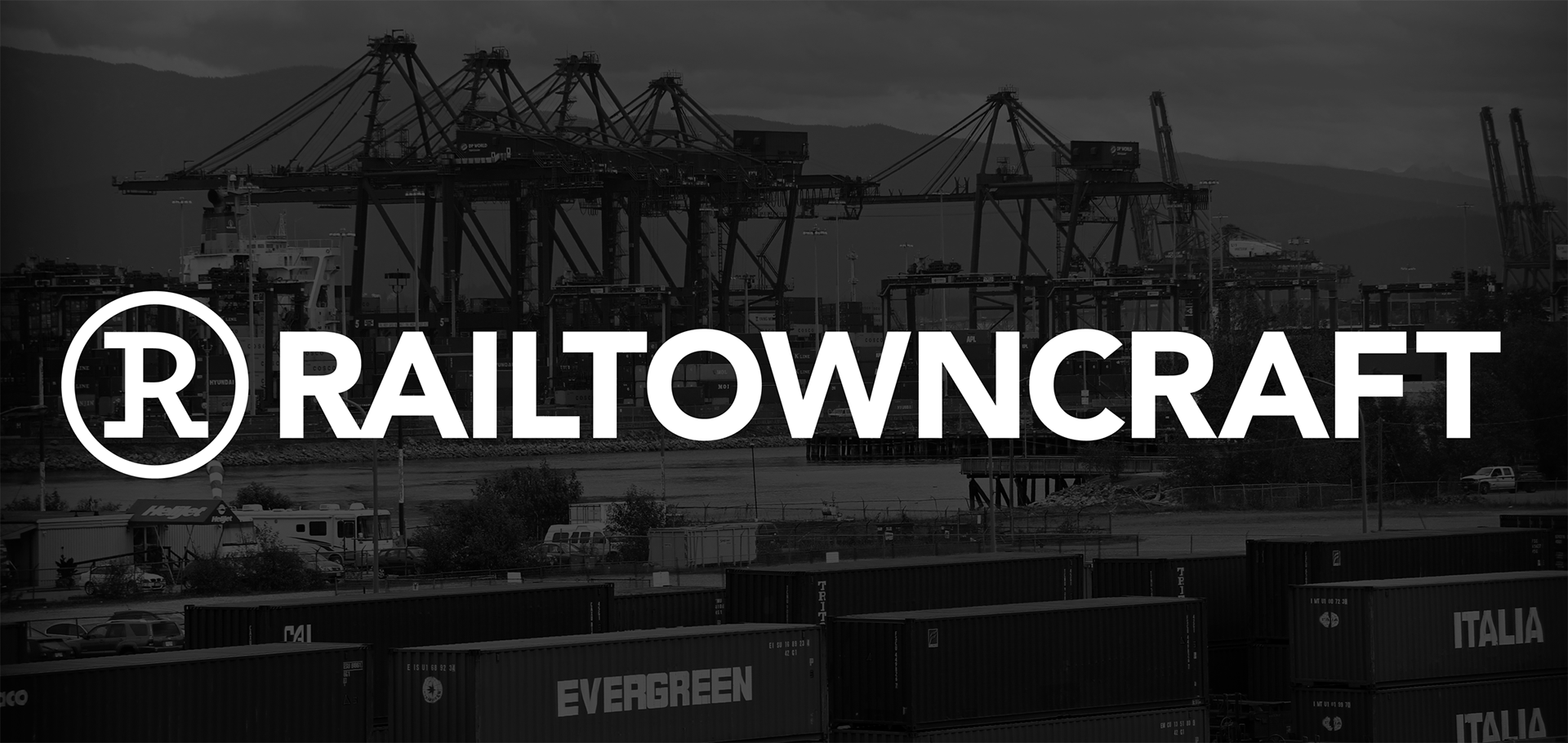
BevCo, a large multinational food and beverage corporation, is aggressively pursuing the development, and launch, of a new craft beer for the local (Vancouver, British Columbia) marketplace under their Railtown Craft Brewery Brand. Railtown Craft Brewery is located in the heart of Vancouver’s Railtown district, a growing design hub known for its unique warehouse loft spaces, cobblestones, and close proximity to Vancouver’s main shipping port.
Objectives
The primary objective of this project is to develop a unique, marketable brand by defining, packaging and branding the new beer for a saturated marketplace. Due to the nature of the market, positioning the product successfully would rely solely on having a unique visual identity and shelf presence.
The target audience for Railtown Craft are young urban males and females, ages 19-35. This free thinking and highly social group appreciates well crafted local goods and unique experiences. They are early adopters and love to enjoy a beverage with friends on evenings and weekends at the local bars and brewhouses.
Solution
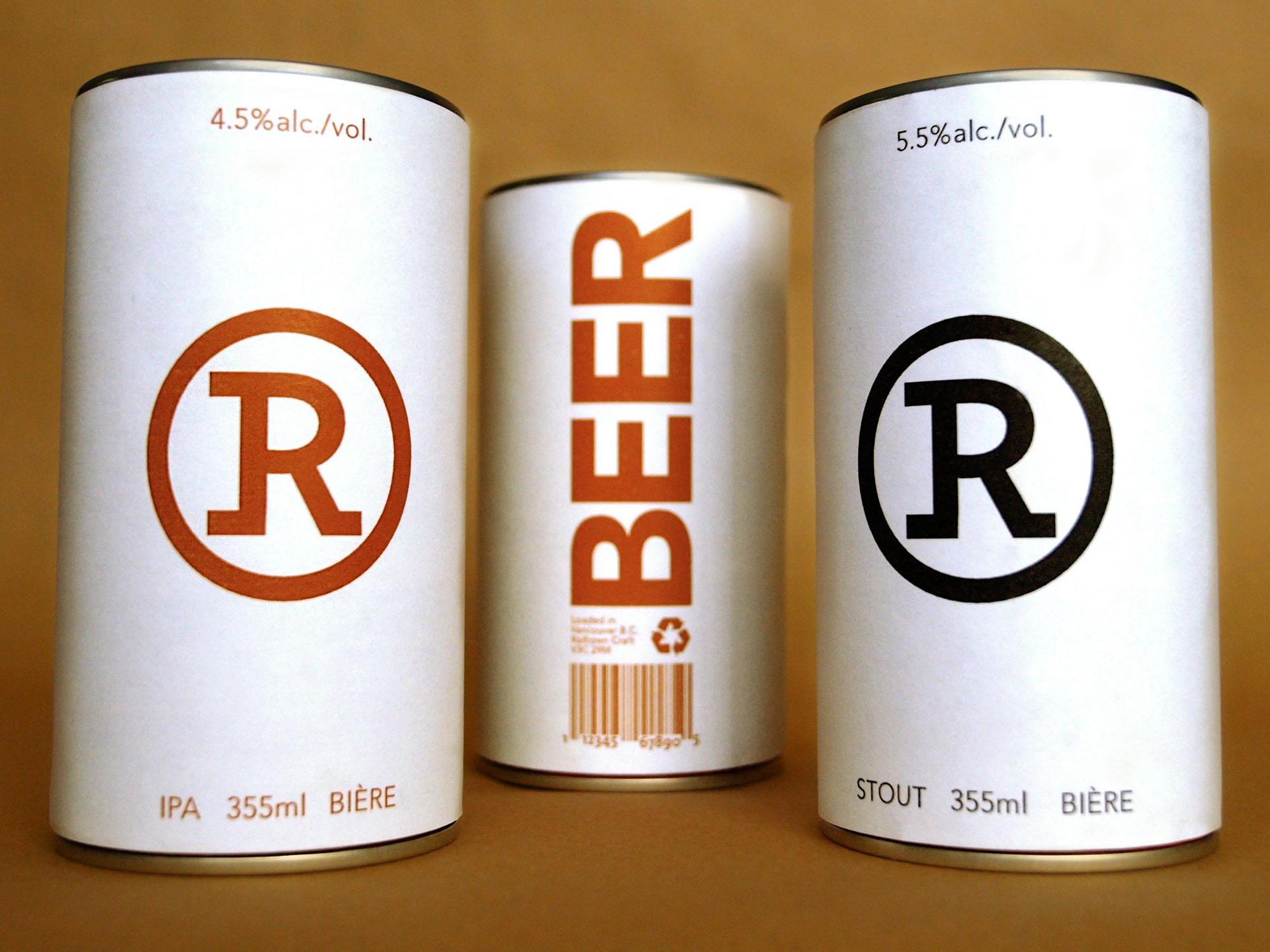
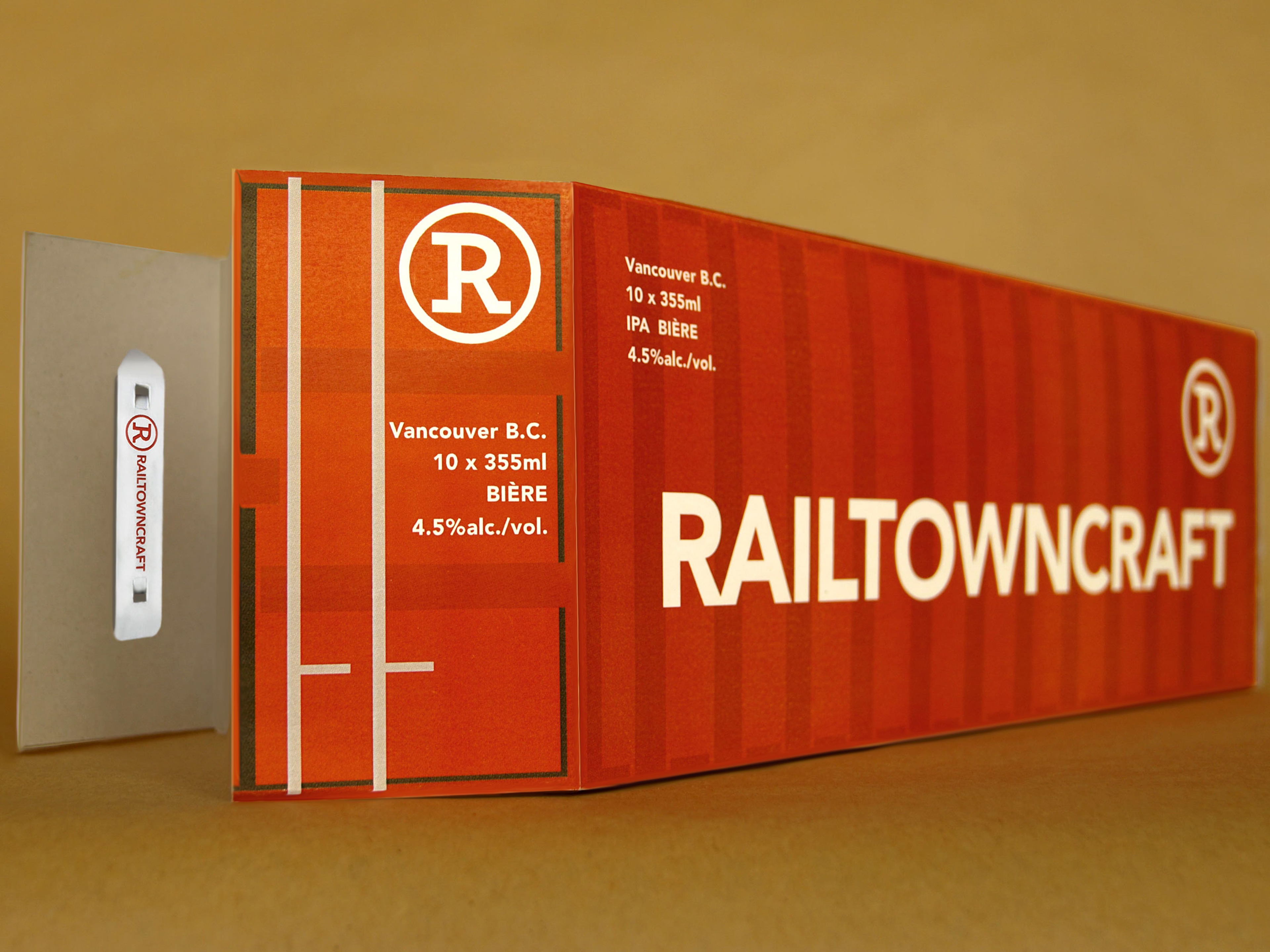
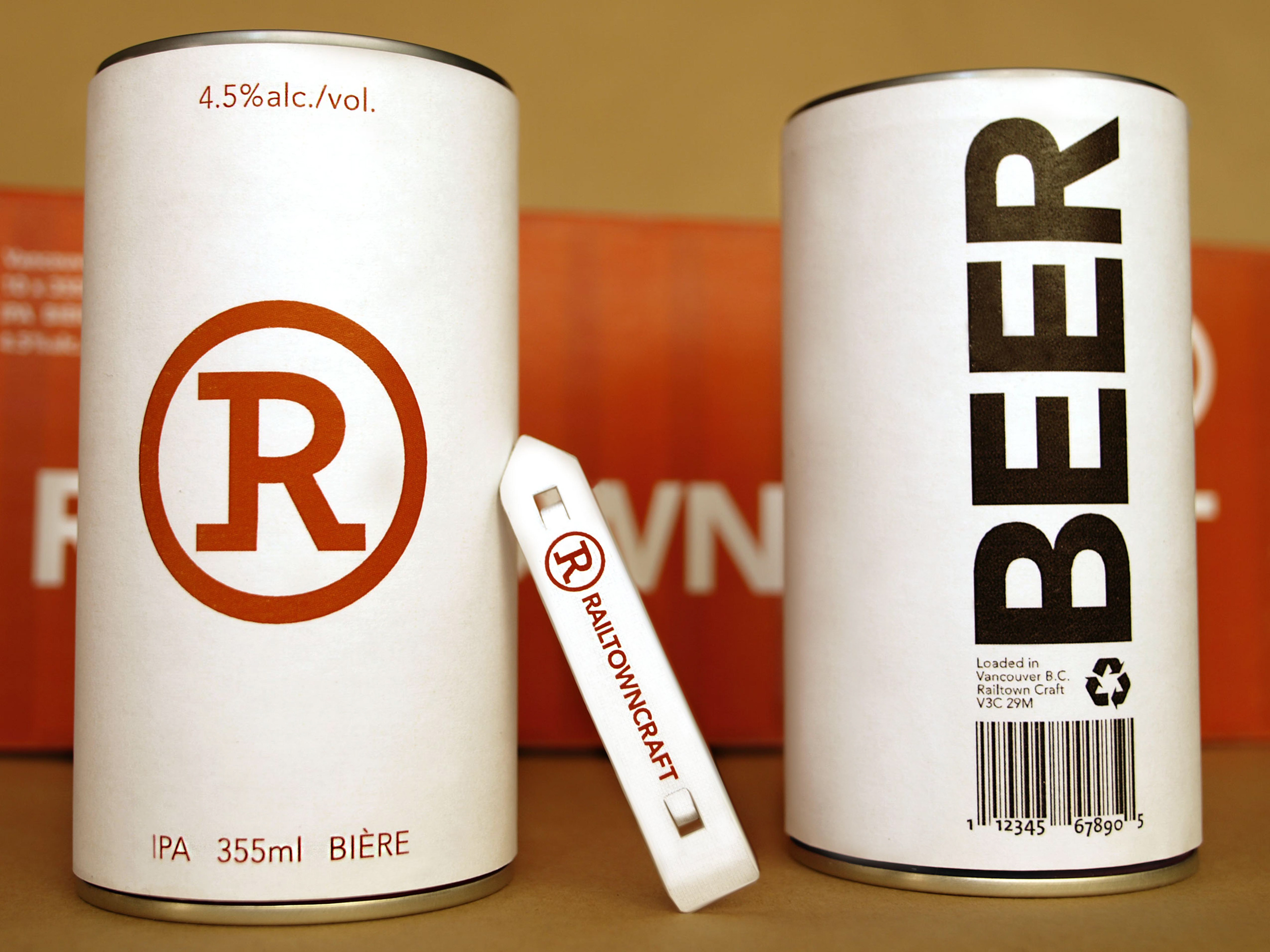
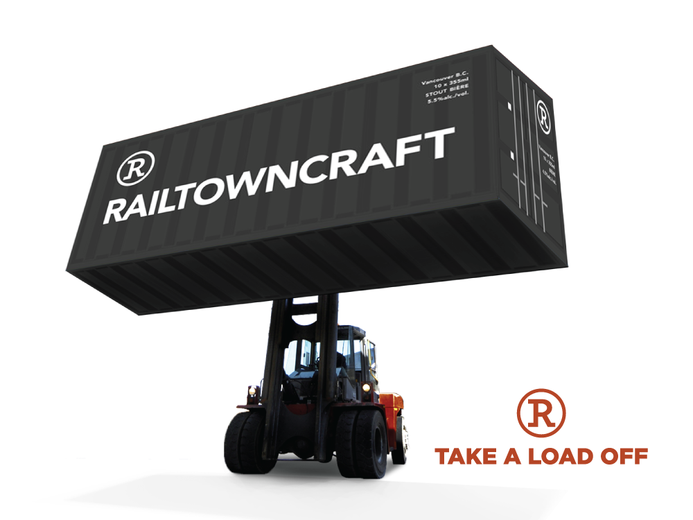
My concept for Railtown Craft is simple and modern. Featuring 1940’s era soft-top aluminum cans, Railtown Craft’s unique identity and packaging engages the target audience, while reflecting the area’s culture and capturing the character of Railtown as a growing design hub. The concept for the labels and packaging are minimalist and well considered, mastering the essence of Railtown’s connection to the city’s main shipping port and the commodities that are imported and exported daily.
Situation
BevCo, a large multinational food and beverage corporation, is aggressively pursuing the development, and launch, of a new craft beer for the local (Vancouver, British Columbia) marketplace under their Railtown Craft Brewery Brand. Railtown Craft Brewery is located in the heart of Vancouver’s Railtown district, a growing design hub known for its unique warehouse loft spaces, cobblestones, and close proximity to Vancouver’s main shipping port.
Objectives
The primary objective of this project is to develop a unique, marketable brand by defining, packaging and branding the new beer for a saturated marketplace. Due to the nature of the market, positioning the product successfully would rely solely on having a unique visual identity and shelf presence.
The target audience for Railtown Craft are young urban males and females, ages 19-35. This free thinking and highly social group appreciates well crafted local goods and unique experiences. They are early adopters and love to enjoy a beverage with friends on evenings and weekends at the local bars and brewhouses.
Solution
My concept for Railtown Craft is simple and modern. Featuring 1940’s era soft-top aluminum cans, Railtown Craft’s unique identity and packaging engages the target audience, while reflecting the area’s culture and capturing the character of Railtown as a growing design hub. The concept for the labels and packaging are minimalist and well considered, mastering the essence of Railtown’s connection to the city’s main shipping port and the commodities that are imported and exported daily.
1940's style soft-top aluminum cans representing basic commodities.
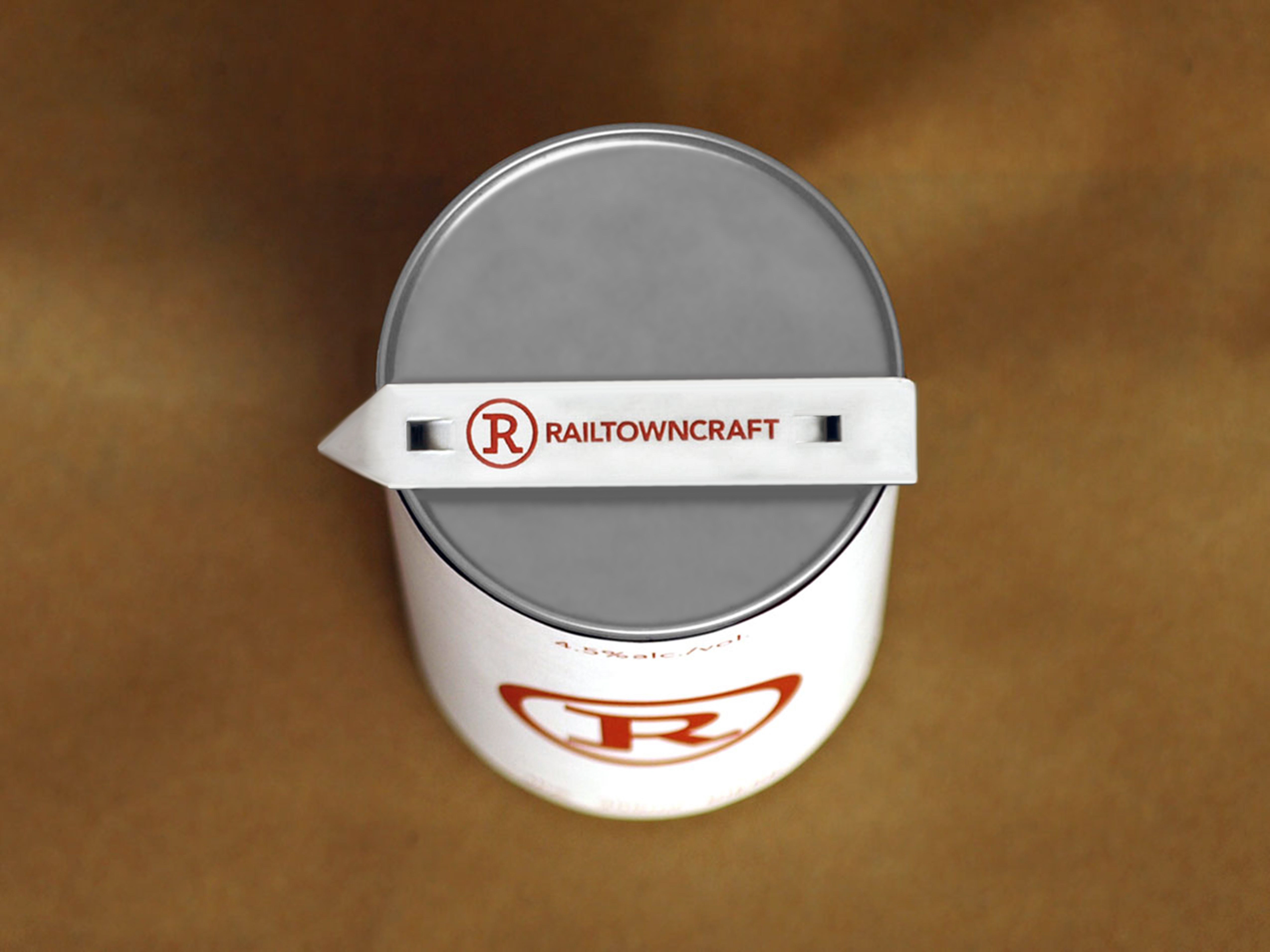
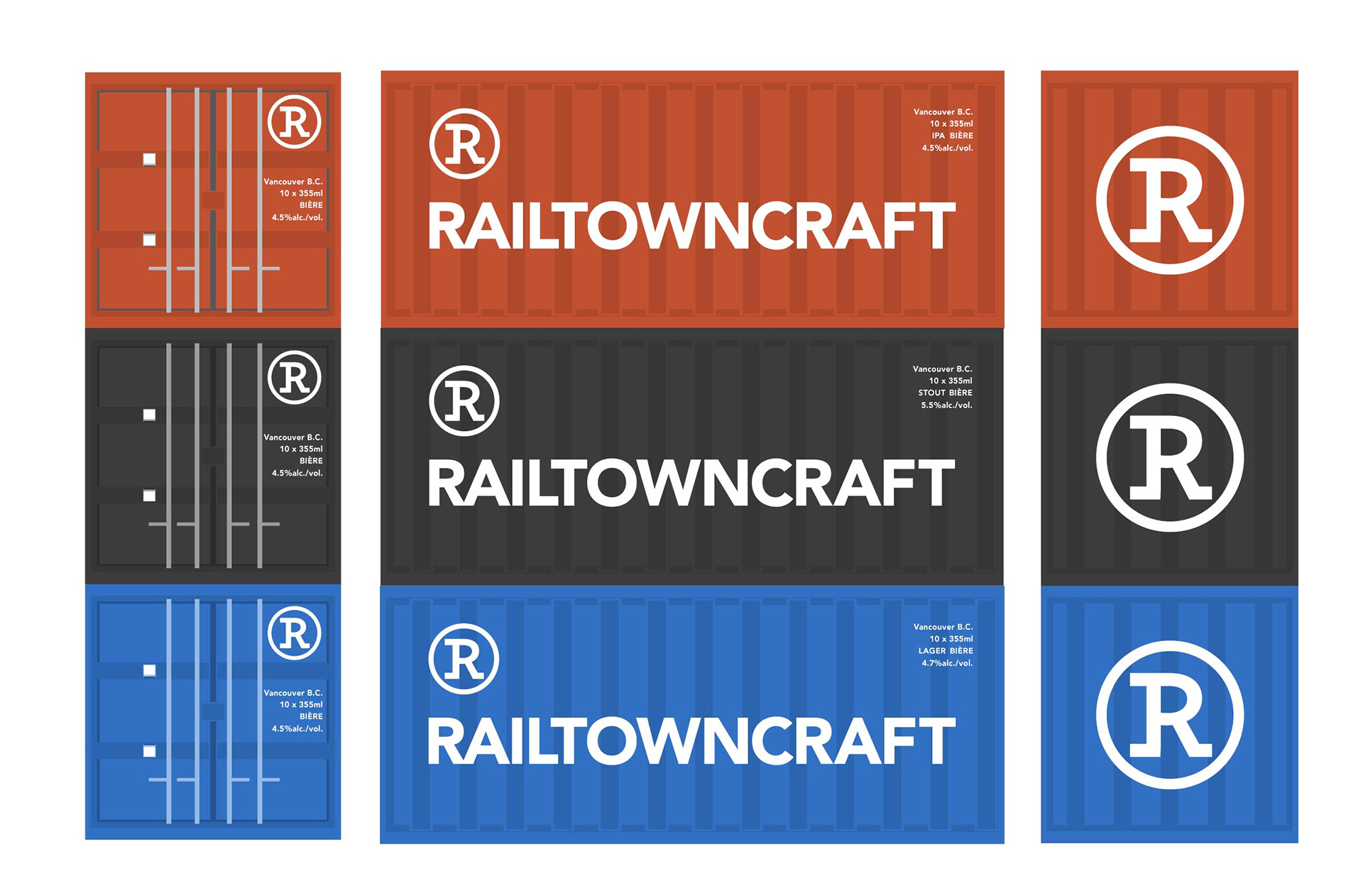
The cartons would come in varying colors (rusty orange, black, and blue). A branded recycled-aluminum key would come free with each case.


Drink Responsibly!